The 10 Commandments of Good Form Design on the Web
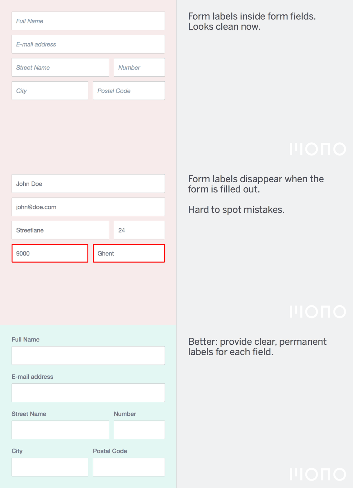
1. Thou shalt provide clear, always visible labels for each field
There is a trend in web design to show form labels only when a field is focussed. This can be cool on a simple form like a username/password form, but for anything longer it is probably a bad idea.
When you have the space to show labels, do so.
Especially in a long form a user will review the input he or she entered; when you can’t read which field corresponds to which label there is no way to do a good review.
2. Thou shalt use a big enough font size
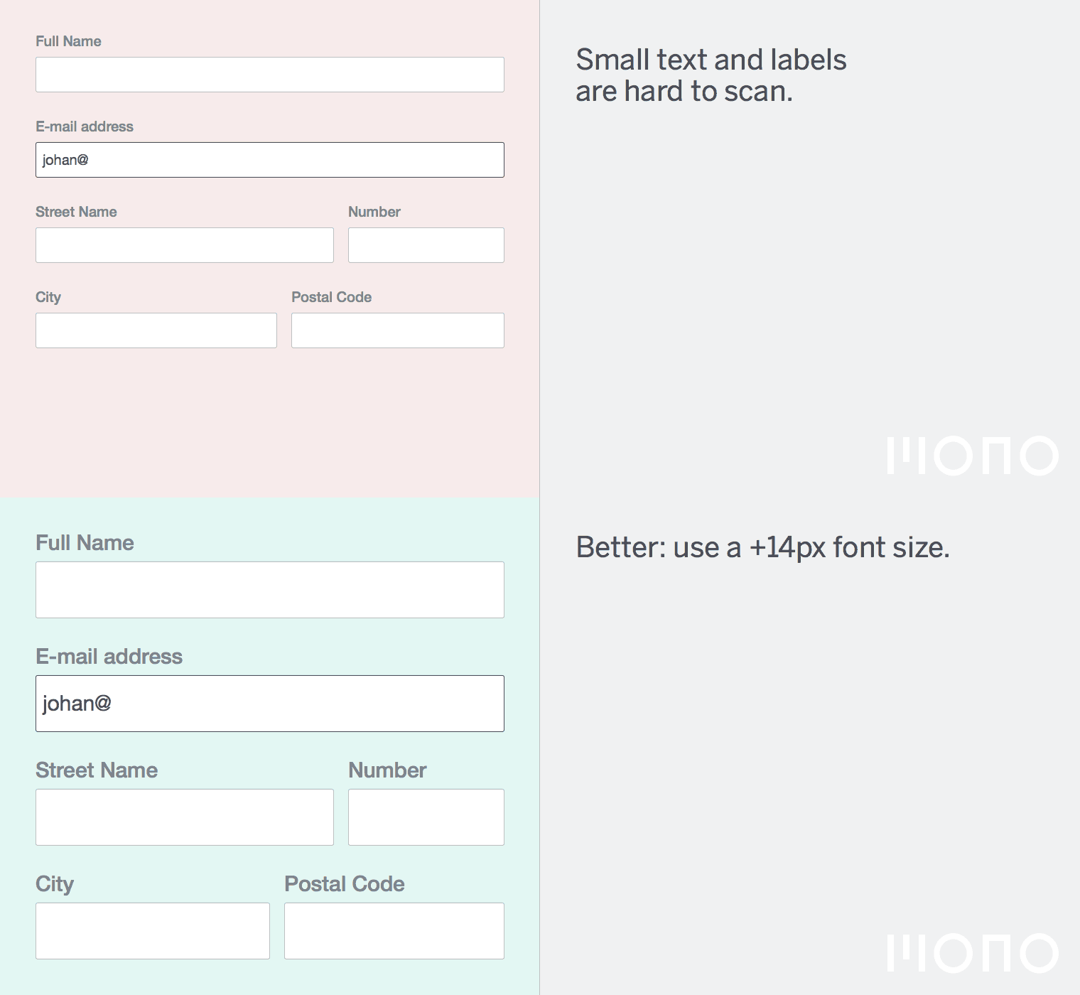
Your fonts have to be big enough to be legible. I recommend at least 14 pixels for body copy. 16 pixels is safe for most fonts. The sizing depends a bit on the context (mobile or not?) and how many other things are on the page. When in doubt, make things bigger.
As an added benefit, if you specify a font size of 16 pixels for input sizes, iOS will not zoom in anymore when you tap a field, simply because it is not needed.
3. Thou shalt provide easily tappable areas
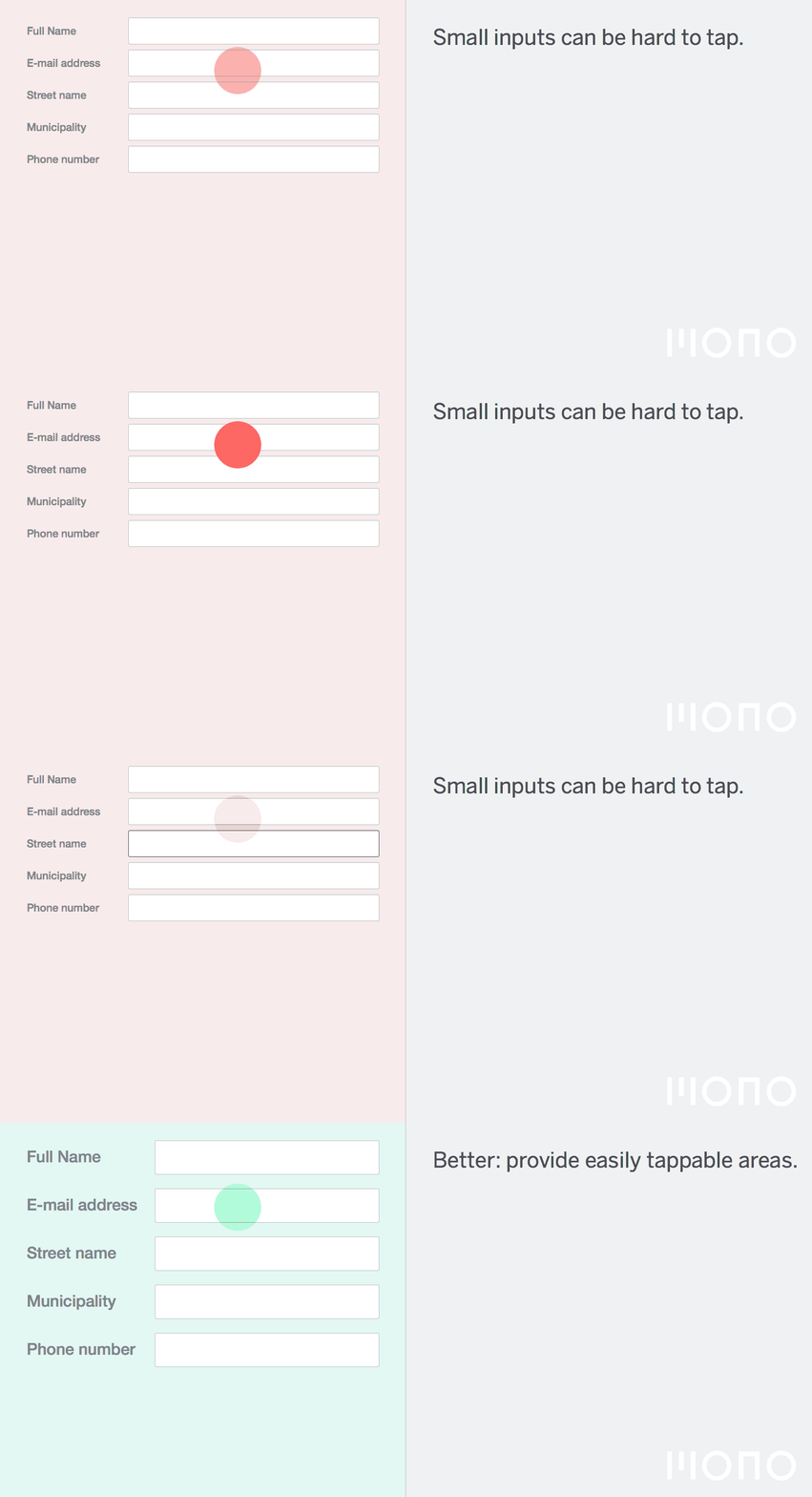
It is likely these days that that someone is using your form on a touch device. Apple has always recommended a minimum 44px by 44px space for buttons as this corresponds roughly to a finger size. This is a good recommendation, although I find that if you are strict about this 44px size you will end up with a screen that is full of fields that feel too huge in a typical web application. I recommend sizing input fields between 32px and 40px in height.
The default input field in Bootstrap 3 is 32px in height, this is a good base size. Fields shouldn’t be smaller than that to be easily tappable.
4. Thou shalt size the input fields according to their expected input
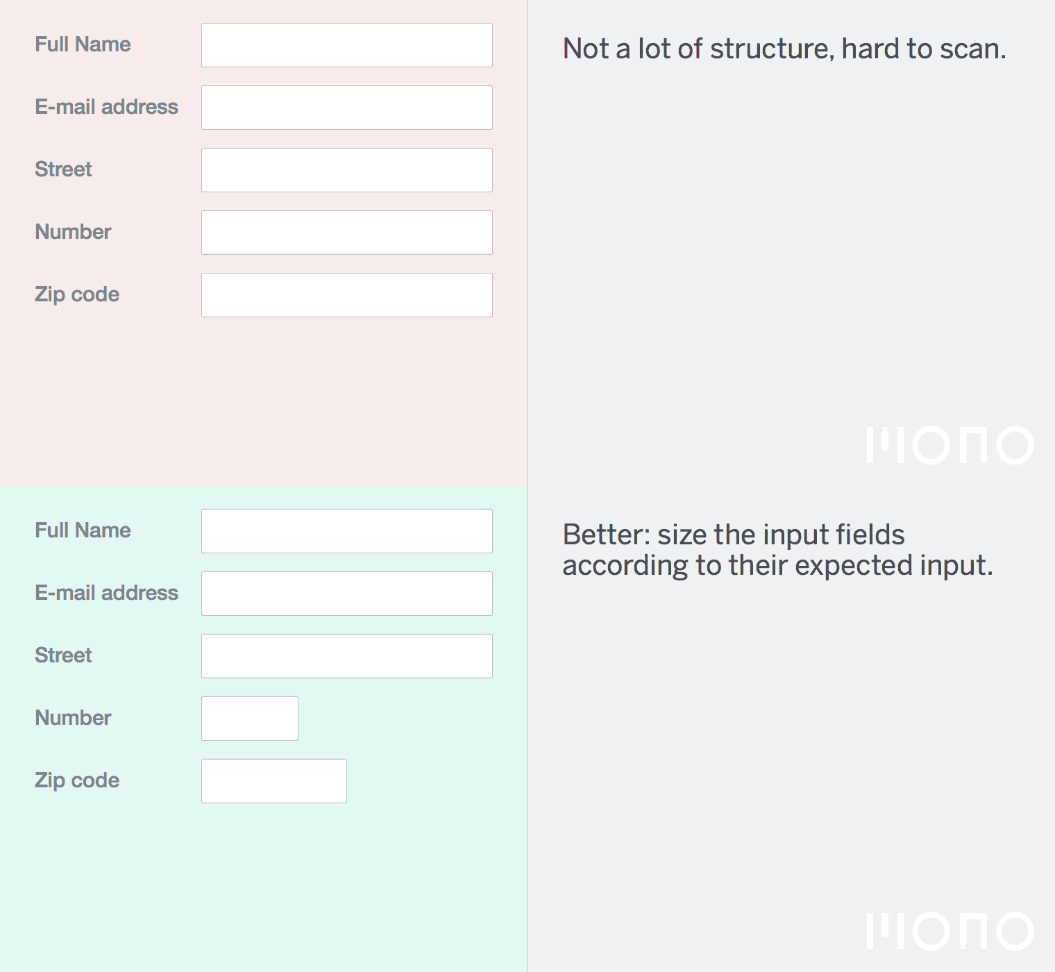
A form that sizes the input fields according to their expected input is easier to read.
For example, when you are expecting a zip code, don’t put a 100% width input on the screen. Think about the minimum amount of characters a zip code has (in Belgium 4 and in Holland possibly 6), then size the input accordingly. The widest possible value is MM0000 so this should fit in your field, using your design’s font as well as the fallback font.
Keep in mind that on Linux the default sans-serif fonts are typically wide so it makes sense to test your designs with a wide font like Verdana, even though you specifically chose a compressed font for your design. On the web you never really know what the user will see in the end.
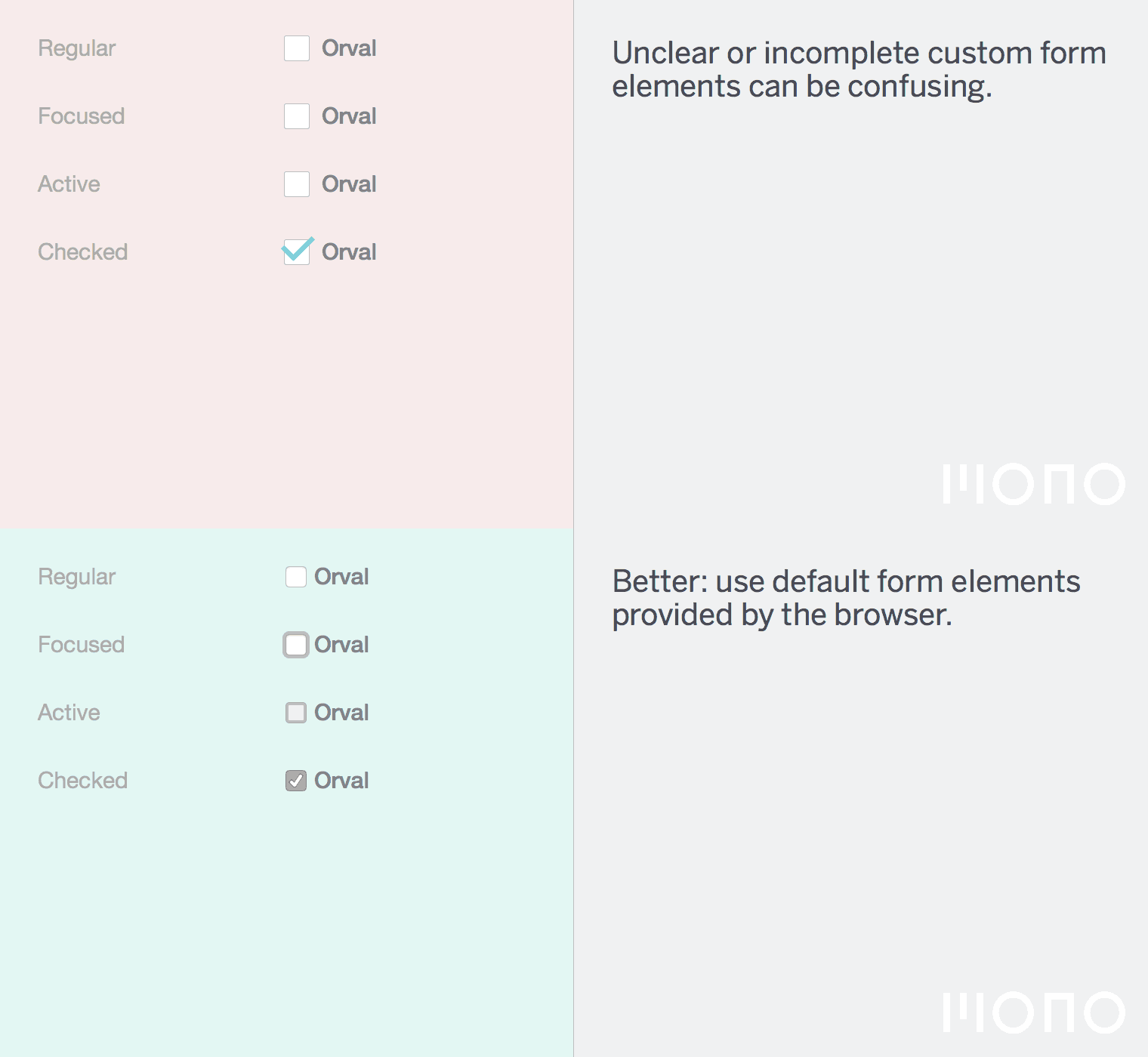
5. Thou shalt not customize checkboxes and radio buttons
All too often I spot a pretty radio button or checkbox that is broken in terms of interaction design. Historically radio buttons or checkboxes are customized using a Javascript library. These days it is possible to do it purely using SVG or CSS.
However, customising the look of the fields often leads to confusing keyboard navigation. 90% of forms I test with customised checkboxes or radio buttons don’t have focus styles and are hard to navigate by keyboard.
I love a nice looking form and a cool SVG animation as much as anyone, but you are actually doing your users a disservice by customising form elements without any added value.
What I mean by without added value is customising checkboxes and radio buttons purely for cosmetic reasons.
Widgets like select2 or date pickers can provide added value to a form that the default browser form elements can’t provide.
6. Thou shalt provide both a general error message and a field specific one
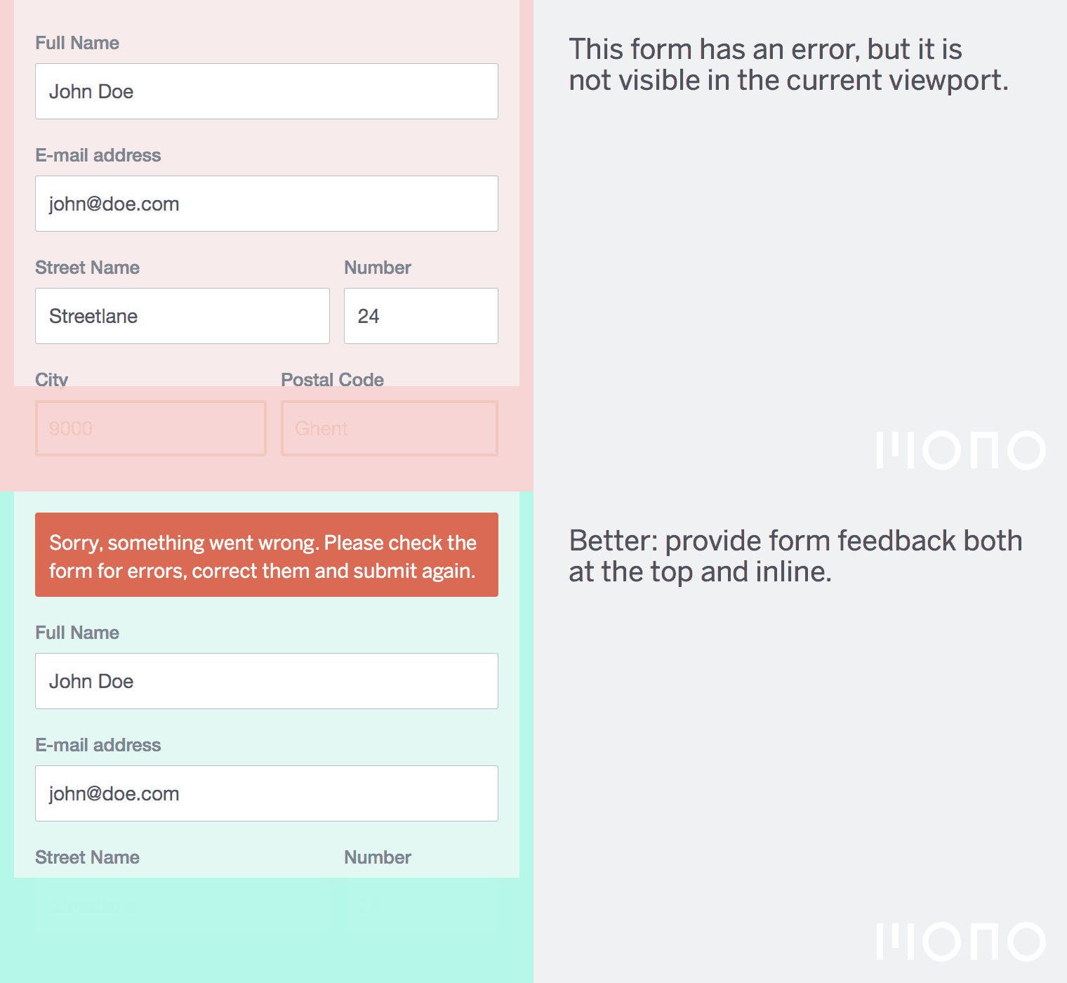
It is a good idea to provide both a general error message, and a field specific one. When a form gets submitted, the user will end up on the same page, but you don’t know if the error is in the viewport.
Put both an error on top of the form (and make sure it is in the viewport on both desktop and mobile) as well as field specific explanations about what is wrong with the inputted data.
7. Thou shalt make it clear what is optional and what is not
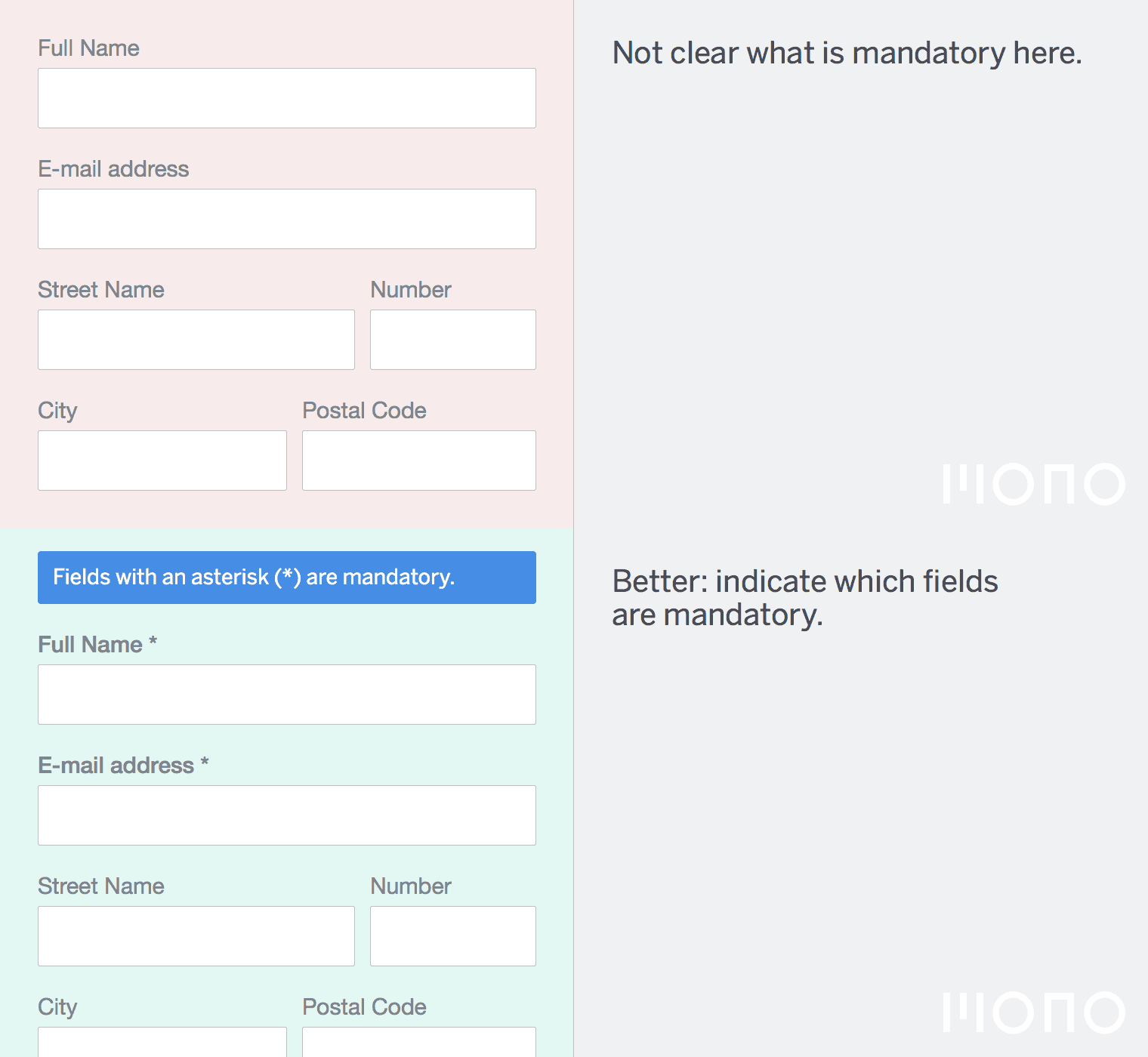
This one seems obvious, but all too often it is not clear which fields optional and which are not.
Using an asterisk * character next to the label is one of the clearest methods. I have been wrapping this * in an HTML element that says “Required field” so screen readers might read this content.
It also helps to group the required fields and the optional fields together if it makes sense in the context of the form.
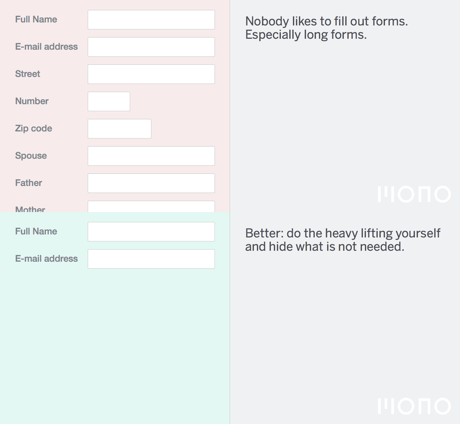
8. Thou shalt hide what is not needed until it is needed
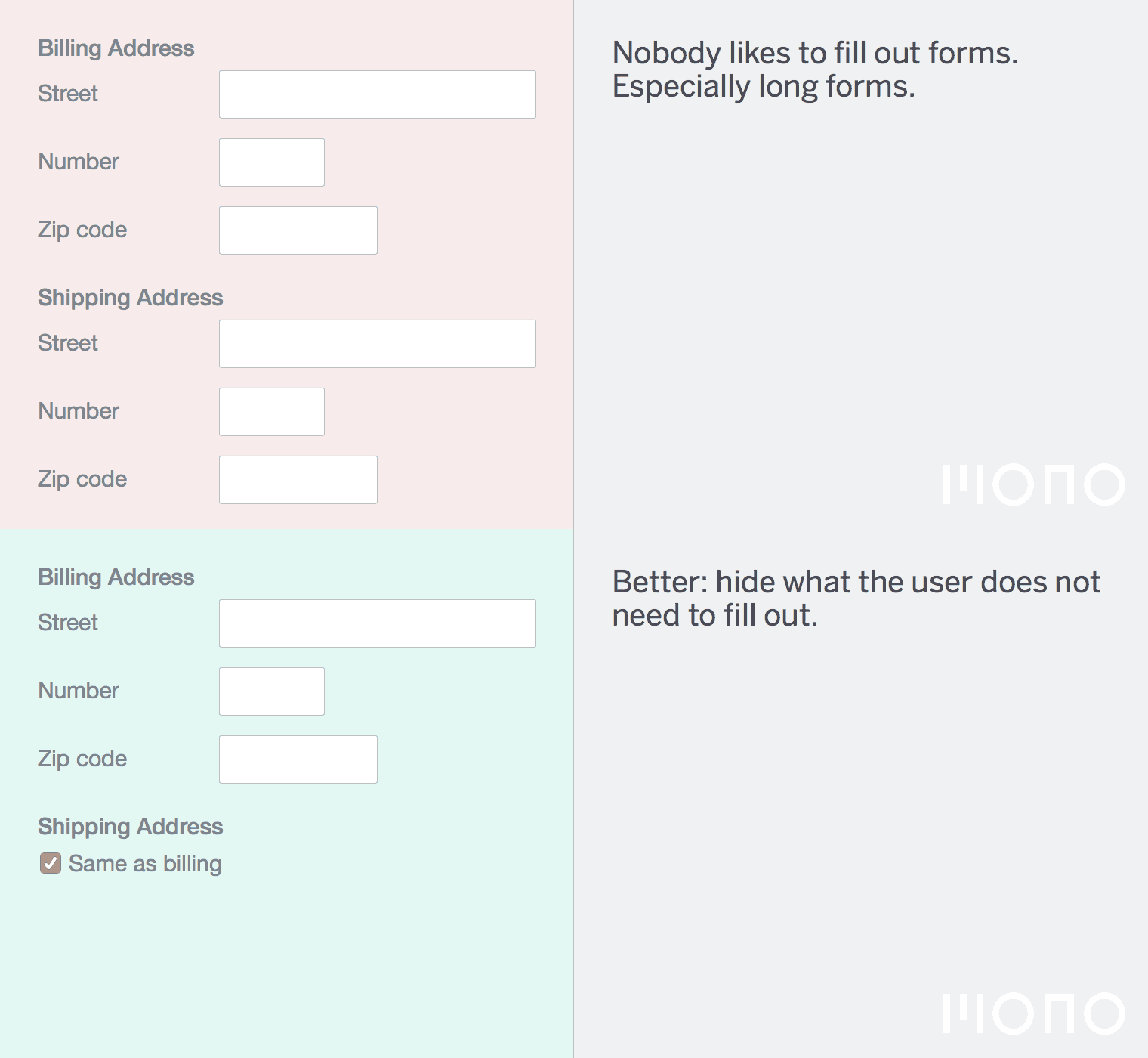
Often there are parts of the form that are dependant on other parts of the form. For example, on an e-commerce site your invoice address might be the same as your delivery address.
In this case it would be wise to hide all the delivery address fields unless the user specifies that the addresses should be different.
Don’t put too many form fields on one page. Try to group things logically and if necessary make it form with multiple steps. Clearly indicate how far the user is to complete the form.
9. Thou shalt minimize user input
Don’t ask for things that are not necessary. Entering data into forms is a chore and not a fun activity (for most people, that is).
Don’t ask for data that you don’t need and provide a clear explanation what the data is going to be used for in a visible disclaimer link on the page.
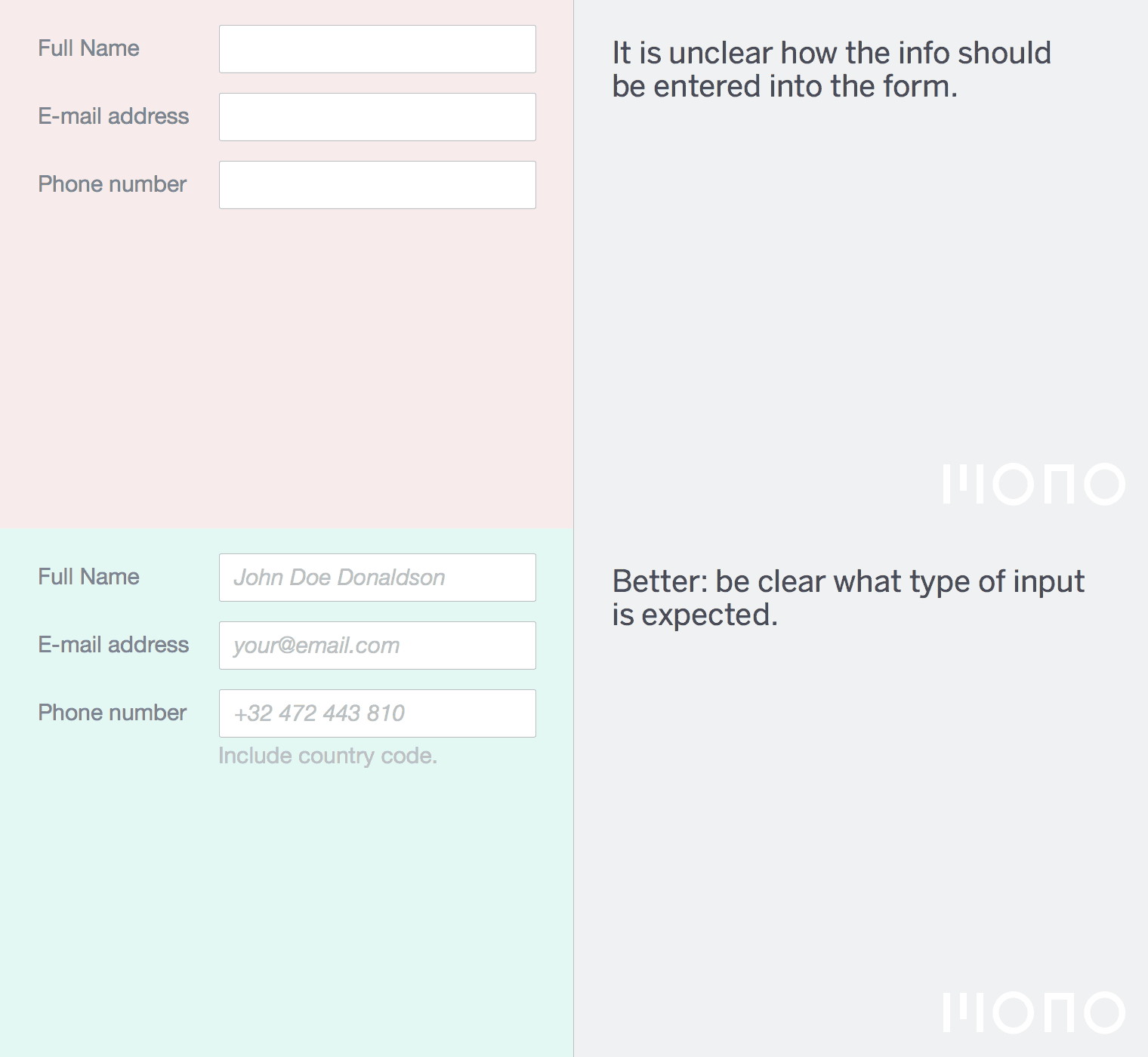
10. Thou shalt be clear what type of input is expected
Data comes in many formats. A phone number can be written with a +, a country code, an area code, or without any of these. What input do you expect?
The best course of action is to be liberal in what users can input and then transform the data to a common format. If the user typed Belgium as their country and they entered a phone number like 0495 20 12 12 you can assume it’s a cell phone number and store it as such.
However, it is not always realistic to be liberal in your input. The 2nd best method is to just provide an explanation below the field that specifies which input is expected e.g. “Enter your telephone number in the following format: +XX 000 000 000 where XX stands for your country code.”
Bonus: Thou shalt only validate a field when a user is done with it
A lot of forms these days validate whenever you leave the field. This is related to the way things work in modern Javascript MVM frameworks.
To validate forms before hitting that final submit button is not a bad idea, but give the user some time to correct their mistakes. All too often an error is thrown in my face while I am fully aware that I still need to fix the input in the field. Even worse is that sometimes a field validates while I am typing in it. Obviously “johan@” is not a valid e-mail address but why throw an error when I’m busy actually typing the correct e-mail address?
Delaying the validation until the user is entering data in the next field is a sensible thing to do.
Subscribe to our newsletter
Receive blog highlights and fresh insights into UX/UI and front-end development.
Leave a comment
Your email address will not be published. Required fields are marked *

47 thoughts on “The 10 Commandments of Good Form Design on the Web”
22 May 2015 at 19:04
22 May 2015 at 19:31
22 May 2015 at 19:41
22 May 2015 at 20:05
22 May 2015 at 20:44
22 May 2015 at 21:25
23 May 2015 at 07:19
25 May 2015 at 05:34
25 May 2015 at 14:34
25 May 2015 at 14:39
25 May 2015 at 14:55
25 May 2015 at 15:07
25 May 2015 at 16:54
25 May 2015 at 17:42
25 May 2015 at 18:53
25 May 2015 at 21:13
26 May 2015 at 13:22
26 May 2015 at 13:35
26 May 2015 at 14:39
26 May 2015 at 15:56
26 May 2015 at 16:28
26 May 2015 at 16:29
26 May 2015 at 17:09
26 May 2015 at 18:37
26 May 2015 at 20:05
26 May 2015 at 22:09
27 May 2015 at 02:54
27 May 2015 at 03:39
27 May 2015 at 04:52
27 May 2015 at 10:53
27 May 2015 at 12:44
27 May 2015 at 15:19
28 May 2015 at 04:02
28 May 2015 at 05:57
1 Jun 2015 at 23:52
11 Jun 2015 at 14:03
20 Jun 2015 at 12:09
25 Jul 2015 at 03:53
8 Dec 2015 at 18:38
12 Dec 2015 at 01:26
12 Dec 2015 at 10:08
15 Feb 2016 at 05:42
21 Mar 2016 at 06:11
17 May 2016 at 10:10
5 Oct 2019 at 16:39
2 Oct 2023 at 18:34
21 Mar 2025 at 21:21