Three more tips for enterprise UI design
Last week, we talked about the challenges that come with designing enterprise software and gave five UI design tips. In this blog post we will share three more tips.
1. Stability above customization
When choosing custom UI components, focus on stable components that are maintained within a larger community.

Ask yourself what kind of plugins you rely on, and how they are maintained? If you write custom code for components, can you also support the maintenance of that code over time?
Did you take all edge cases into account? You might think you can get away with using a simple plugin, but web development is never as simple as plug and play, especially in an enterprise context. Does the solution work in the expected browsers? Does it handle internationalization? What about the license rights? These are questions that need answers.
2. The brand shouldn’t affect usability
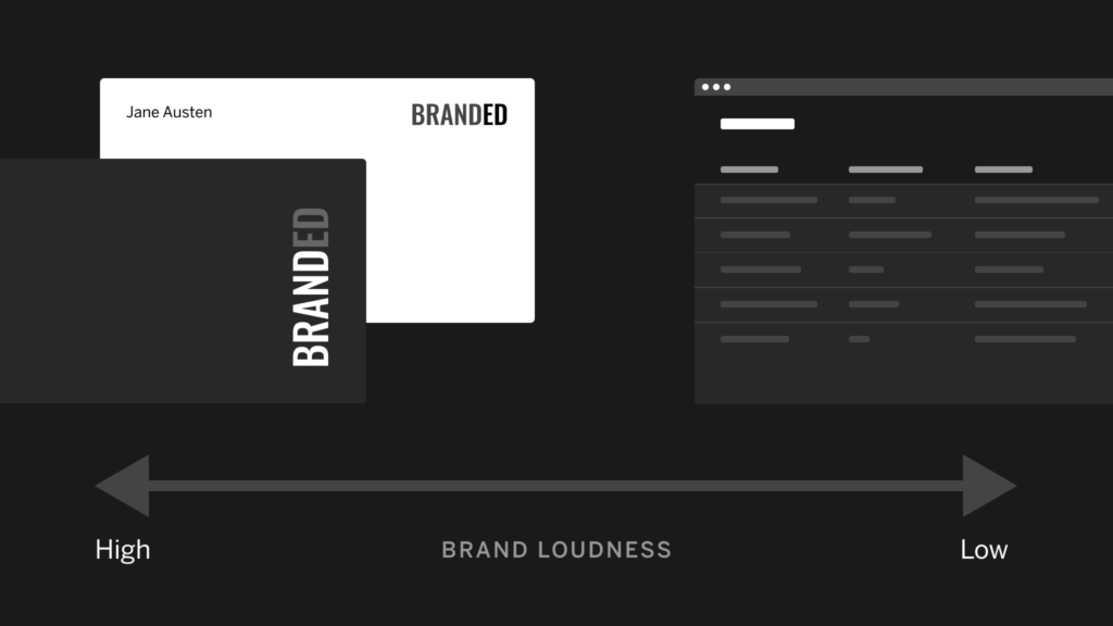
There is a common requirement that interfaces should be branded for the customers in question. Be careful with this as it might affect the usability of the application.
There is a place and a time to be loud with your brand. Enterprise UI design is not.

Restrict the branding to subtle elements around the interface, and make the brand shine on pages where you have the room to do so, like login pages, confirmation e-mails etc. But above all, show restraint here. This is not a marketing exercise.
3. Blue is your friend

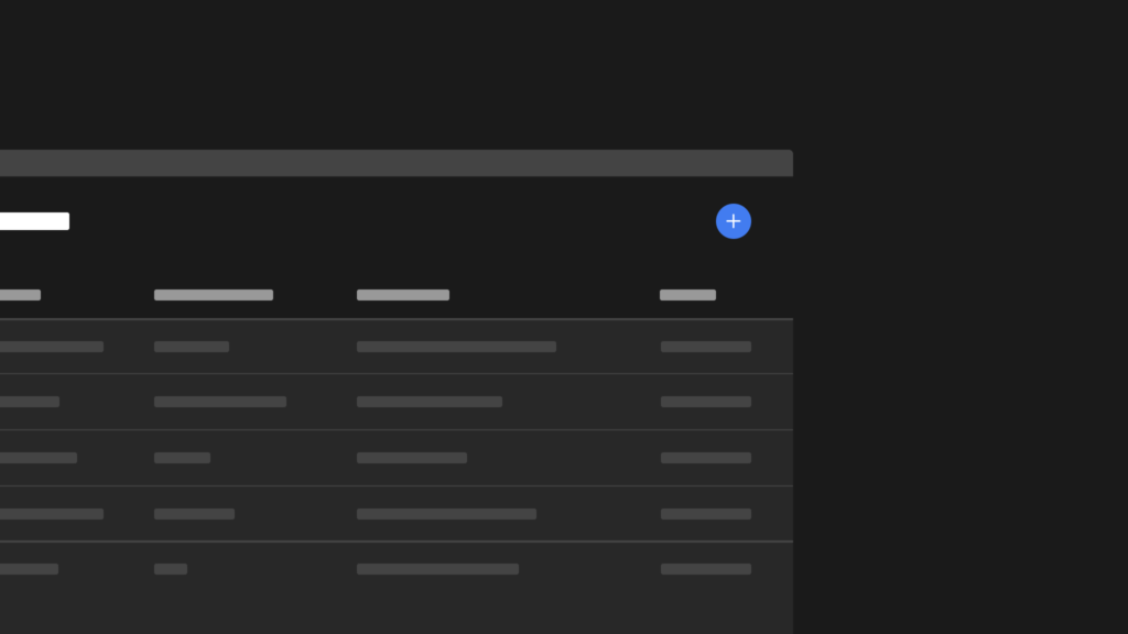
The color blue doesn’t conflict with many common UI patterns.
Highlighted text? That’s yellow! Success message? Green! Form error state: red, obviously. Using blue avoids nasty design discussions about “the brand” versus usability. And that’s the way we like it for enterprise UI designs.
Subscribe to our newsletter
Receive blog highlights and fresh insights into UX/UI and front-end development.

Leave a comment
Your email address will not be published. Required fields are marked *