Five UI design tips for enterprise software
We have been designing a lot of enterprise software, which comes with its own set of challenges.
In this blog post we captured some of the lessons we learned while creating the types of interfaces that are meant for daily, high-productivity use.
1. Adjust your scaling
A lot of framework defaults are just too large for enterprise design software. You need to be able to contain a lot of data in a limited space, so adjust your scaling accordingly.
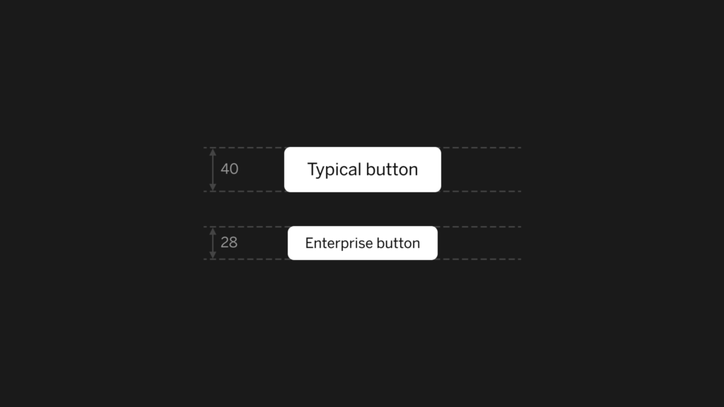
For example, in Material Design, buttons are 36px high. But this is just way too large for enterprise UI design. It’s a good idea to adjust your scaling, but also to provide a global scaling mechanism through CSS. Here’s some example code:
html {
  font-size: 62.5%;
}

body {
  font-size: 1.6rem;
}

@media (min-width: $bp2) { // $bp2 refers to a breakpoint variable
  font-size: 1.4rem;
}
The requirement of a lot of interfaces these days is that they work on tablets. This has also brought with it a preference for larger touch targets. Large touch targets are not a negative, but if the requirement is to see a lot of data at once, we are stuck with opposing requirements. A balance has to be found.
If we know that most of the time our application is controlled by expert users with a mouse, we can get away with much smaller buttons. We might want to make the decision to provide a separate interface for touch, or to adapt the user interface when touch usage is detected, but that’s another story.
2. Be wary of the application and module layers
Enterprise software can be a complex and multi layered beast. Be aware of the global structure.
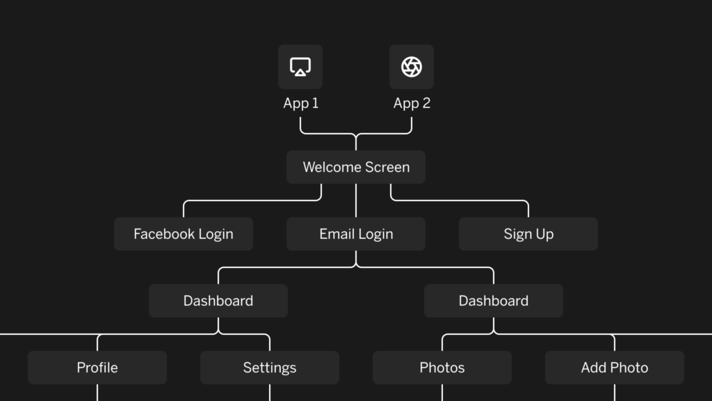
You should know which parts are separate applications, which parts are modules, and which types of users are using which modules.
An example is a navigation bar, that contains six or seven modules which the admin sees. But the actual users — let’s say 90% of the user base — only see 1 or 2 items. You might want to revisit your design based on those users and not the admin users.
3. Clarify where you are with signposts
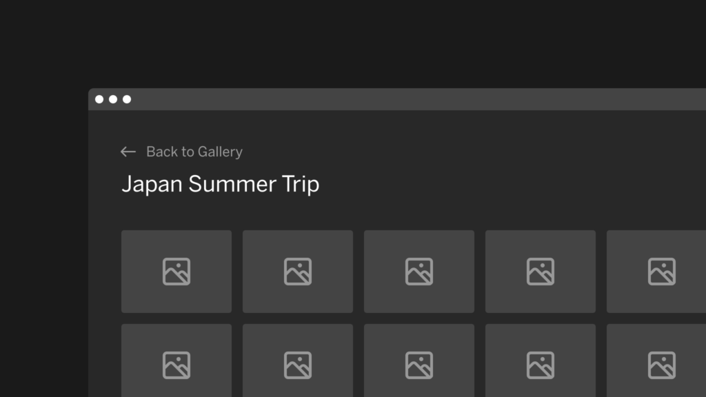
Add signposts to show the user where he or she is. These can be clear selected states, page titles, breadcrumbs etc.
We see a lot of web apps where the browser title stays the same. Just like with websites, it’s a good idea to change your document title according to where you are.
4. The browser provides the windowing
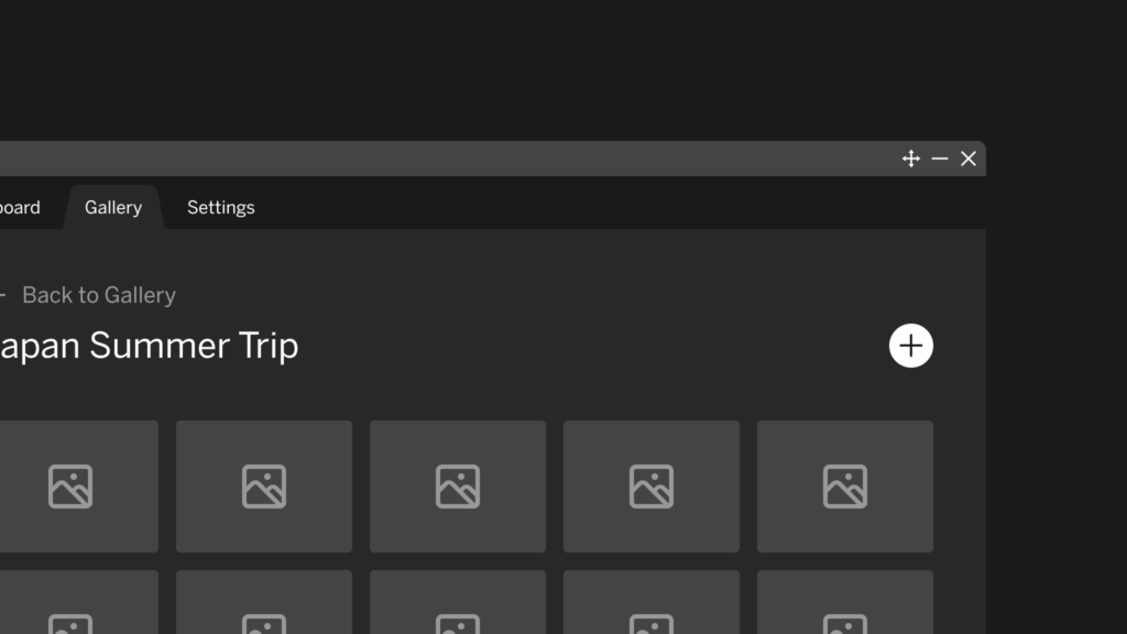
Unless you are actually building a windowed desktop application, resist the urge to build your own windowing logic.
The user’s browser is actually already providing a much better windowing environment.
There are exceptions to this though. If your app is complex enough, it might need its own windowing system. In this case, it might be interesting to think about docked panels first instead of a full-blown windowing implementation. A good example of docked panels is the current implementation of the chat on Facebook and LinkedIn.
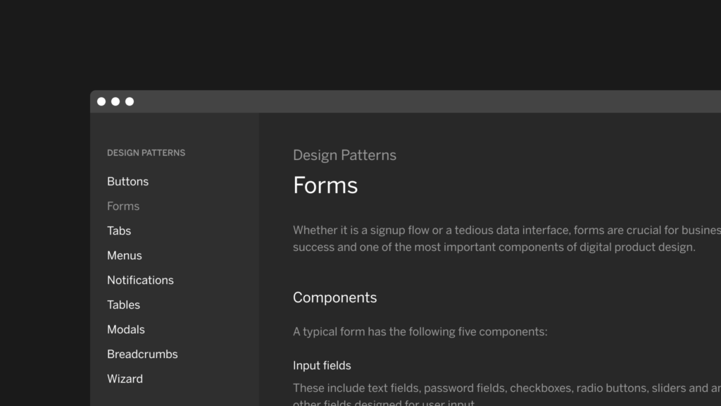
5. Focus on design patterns
Enterprise software typically comprises hundreds of screens. Since it is impossible to design every screen individually, focus on design patterns.
Think about what a standard dashboard, a standard datagrid, and a standard detail view looks like, then work from there.
Make a split between navigation patterns and content patterns. A navigation pattern could be a consistent logic to do first and second level navigation. A content pattern could be something like tabs, a sortable datagrid, or a series of cards.
Want to read more? Check out our second blog post with three more tips.

Subscribe to our newsletter
Receive blog highlights and fresh insights into UX/UI and front-end development.
Leave a comment
Your email address will not be published. Required fields are marked *