Remote Usability Testing
Last week I conducted a remote usability test with five persons.
At Mono we have conducted usability tests in the past, and mostly we did them in real life. We would sit with the participant and use an iPad to run them through a scenario.
I wanted to share my experience and our process in regards to doing this in a remote way. However, most of this blog post applies equally to regular usability testing.
Why a usability test?
First of all, why a usability test? The reasoning behind usability testing is twofold. The first reason is to validate your design assumptions. The second reason is to talk to the people who will use your product to broaden your perspective.
Tools used
The design project we were on used mockups that were made with Adobe Illustrator. We mostly use Sketch these days but I was happy to find out Illustrator’s performance improved vastly compared to the last big project I did with it.
The mockups were exported to PNG format, and these mockups wered tied together in Invision to make a clickable prototype.
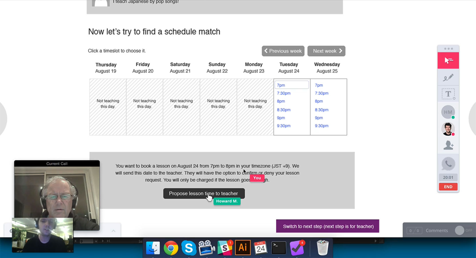
We then used Invision’s LiveShare feature to show the prototype while simultaneously calling each other on Skype. I used the excellent Screenflow to record the screens to share the videos afterwards with the client.

Scenario and setup
We were doing the usability tests for Classdo, a Japan-based startup whose application is about connecting teachers and students. We chose the scenarios based on Classdo’s business needs.
We chose to limit the test to 5 participants so we could fit the usability testing into two days. Due to careful planning we were able to do all sessions on a single day. Even though there were only 5 participants, we did our best to have a wide variety of people. 3 women and 2 men; some techy, some not, with different perspectives on the application.
We wrote a few scenarios that were transcribed in a separate document. I found that the prototypes and mockups mostly speak for themselves, so the scenarios were described in a very general way, for example “a user signs up”, “a teacher manages his teaching schedule” or “a student tries to book a lesson”.
The calls themselves
When it was time to call, I would first ask the person if they were OK to be recorded. Then they would receive the link to the prototype, and we would look at it together.
Most people have never done a usability test. I would “warm them up” by walking them through the sign up part of the site (a relatively simple part) before going through the more difficult scenarios. This allowed them to get used to the way they could navigate through the prototype.
During the calls I would ask them to think aloud. Since I designed the wireframes we were talking about myself, I knew a whole lot about the application, but I tried not to say too much.
When they got stuck I would guide them, but in general I would be silent, looking at how they used the application. When we had been through the different scenarios I would ask some general questions about using the application to relate their answers back to their experience and goals.
Is a usability test expensive?
Usability tests are often the first things to get rejected from a project offer. I think a usability test doesn’t have to be expensive and can be done in a single day as proven here. You just need to limit it a bit.
By making it remote you can fit more people in a single day, and it’s easier to have impromptu tests in the future. The work to prepare the scenarios and to find the candidates shouldn’t be underestimated though.
Conclusion
I learned a lot and was able to report different findings back to the client. As an example, I rely a lot on blue hyperlinks in my designs, always arguing that people know how this works.
But the tests led me to believe that it’s really navigation items and buttons that do the trick. Hyperlinks were largely ignored throughout the whole process.
After the test I shared the recordings and my findings to the team. A lot of issues were remedied the next few days in our screen designs.
As designers we think we know how people use applications, but doing a usability test can be eye-opening.
Subscribe to our newsletter
Receive blog highlights and fresh insights into UX/UI and front-end development.
Leave a comment
Your email address will not be published. Required fields are marked *

4 thoughts on “Remote Usability Testing”
11 Sep 2015 at 00:33
11 Sep 2015 at 02:25
6 Oct 2015 at 11:41
17 Feb 2016 at 17:03