How We Document User Interfaces
Writing documentation is no fun, but it’s part of the job. It’s a bit like cleaning your house: you don’t like to do it but after you did it you’re glad you did. How’s that for an analogy?
This post is about how we document user interfaces. The answer, as always, is that it depends on the project.
There a variety of factors that influence the way we will write the documentation:
- How the application will get implemented (basically: is it HTML/CSS or native code)
- The composition of the development team (do they have a front-end developer skilled in HTML/CSS?)
- Whether there are designers on the client’s side
For us, there is a big difference between documenting a native application or a web application.
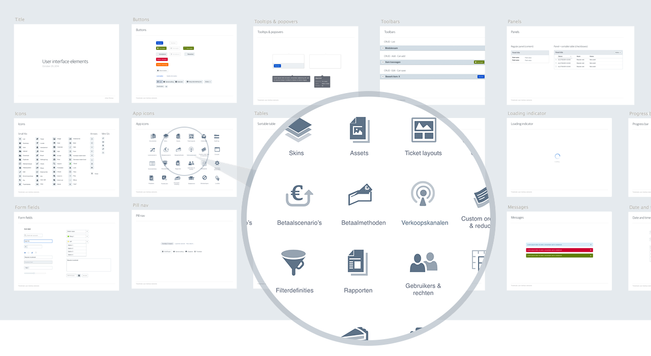
Application documentation is typically a set of pages listing all of the UI components of that particular project. It looks a bit like this:

In the beginning of new projects, we sometimes go ahead and build parts out directly in HTML. Other times it’s necessary to be pixel perfect in the design tool, for instance when an implementation depends on bitmap assets, as is the case with for example an iOS application.
These days we mostly use Sketch to design applications. We found that the Sketch Measure plugin is helpful in automating some of the arduous tasks.
If it’s a web app and we are involved in prototyping or the implementation, we usually work with a library of HTML/CSS components. Ideally this is an HTML/CSS version of what was previously designed in a graphics program.
A web app prototype usually contains a style guide page that lists all the components.
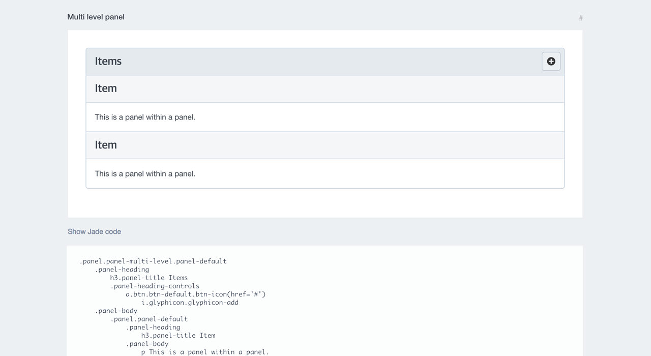
These components are divided into “samples” which are all the UI variations of a single component. For example, this is a sample called multi level panel, which is part of the panel component:

Notice that we also provide a handy way to copy the corresponding HTML – or Jade in this case.
A lot of the process of building documentation is automated, but that doesn’t mean it’s automatic: you still have to write the docs. Most of our UI documentation is either graphics or code. We prefer to use little words in our UI and let the work speak for itself.
In long projects there is sometimes a 1:1 relationship where a component both exists in Sketch version and HTML/CSS version. This is usually a good sign that a project is nearing completion: the UI has “stabilized” – all the necessary components exist to do what is needed.
Subscribe to our newsletter
Receive blog highlights and fresh insights into UX/UI and front-end development.

Leave a comment
Your email address will not be published. Required fields are marked *