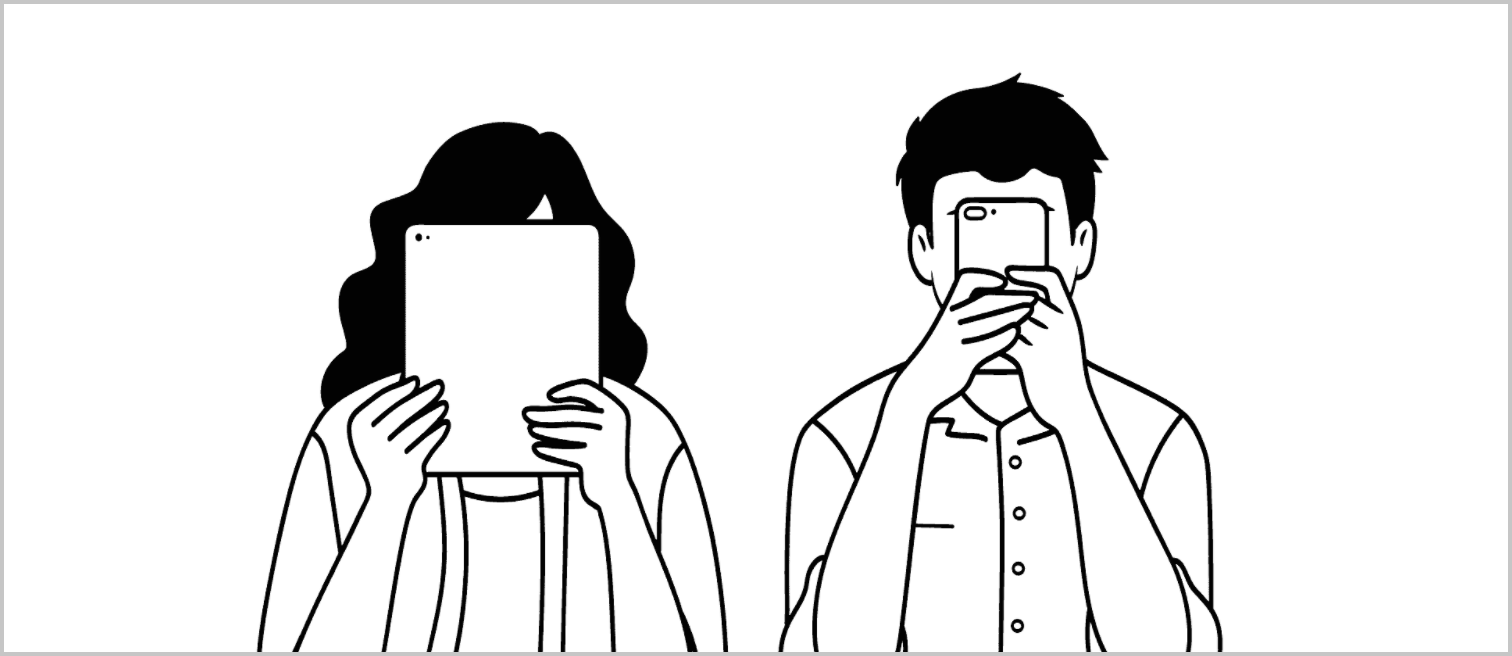
A brand new website

Over the summer holidays, we’ve been working on what you’re looking at now: a brand new Mono website.
Clearer services and better cases
One of the most important additions is the design services page.
Designing a website is never just designing a website. It’s an exercise in what you want to communicate to the outside world. What do you actually do? The design services page is our best attempt to communicate what we do, the types of projects we work on, and why you would choose us over others.
We also updated how we present our work. On our previous site, the homepage didn’t show any work. Today, our homepage opens with two of our strongest cases: SweepBright and
A focus on quality
We focus on quality, and I hope this is apparent from our website. Every piece of copy on this website has been iterated upon. We worked hard to make every asset look the best it could (damn responsive images!), and then load as fast as it could.
There are subtle animations all over the place; there’s the custom illustrations; there’s the way that this website uses the most modern CSS techniques available (CSS grid!), while still providing a good fallback for older browsers.
Looking to grow
As a company, we are definitely growing and evolving. To support this growth, we have open positions for two more designers, one UX researcher/analyst and one UI designer. We like to think that we’re a bit different than most companies out there, and we’re looking for the best on our quest to become a world-class design team.
In conclusion
Designing a website is never easy, but I’m glad we finally shipped it. Now I’d like to return to working on kickass design projects.
Do you have a challenge for us? Get in touch – you can even chat with us now, directly from the contact page. Please send us comments, questions or feedback!
Subscribe to our newsletter
Receive blog highlights and fresh insights into UX/UI and front-end development.