Using Figma Community resources to design for Android efficiently
We’ve recently had a couple of projects for Android that have led us to do some research on Material Design and Android UI kits. We are mostly working with Figma these days, so we took a dive into the Figma Community section to look for quality kits that we could use as a baseline for our new designs. Here’s what we found out and what ultimately worked for us.
Our favourite kits
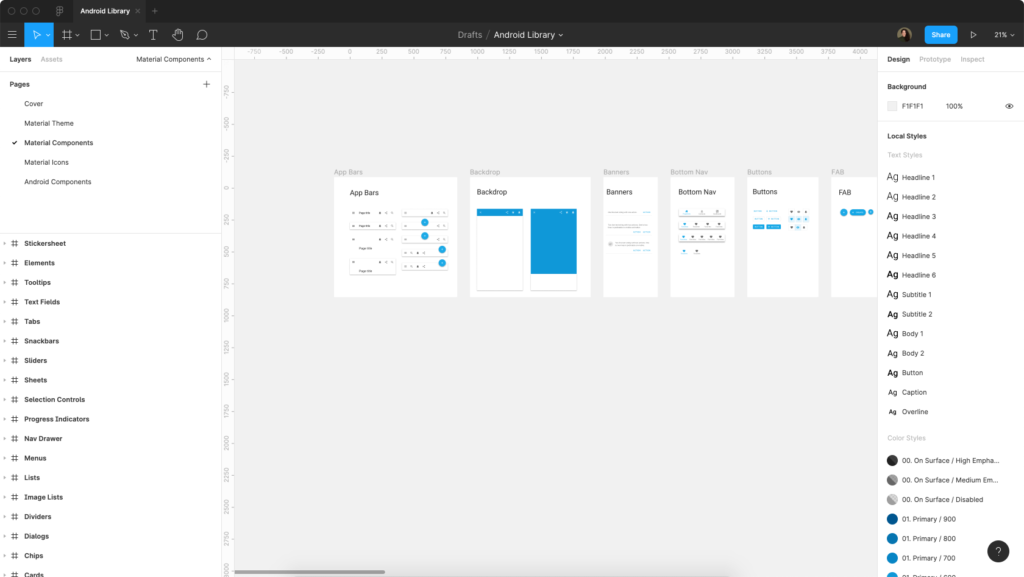
Material Baseline Design Kit
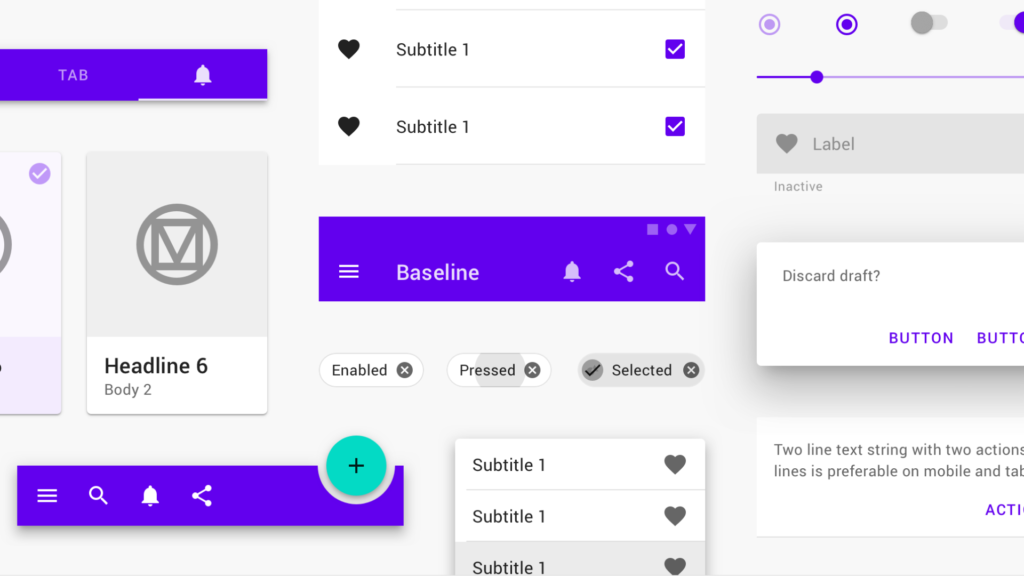
This is the official UI kit by Material Design on Figma Community. The file is well documented and easy to use. It also contains some useful guidelines to help you customise both text and colour styles for your own designs. The same file is also available in dark theme, if that suits your project better!
Material Design 2.0 Theme Kit
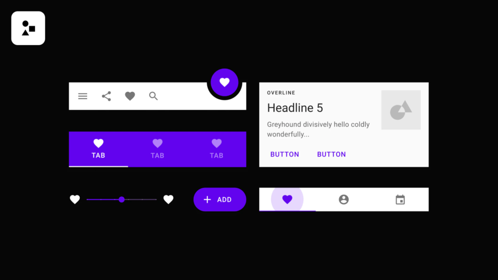
The Figma team also did their own take of the Material Design UI kit. This file includes a comprehensive explanation about how to configure the global styles (colour and typography) used in the file to fit your own project. What we specially like about it is that, since this file comes from the Figma team, you can be certain it follows all of Figma’s best practices concerning the use of components, styles, constraints, etc.
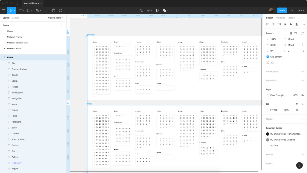
Material Design Icons
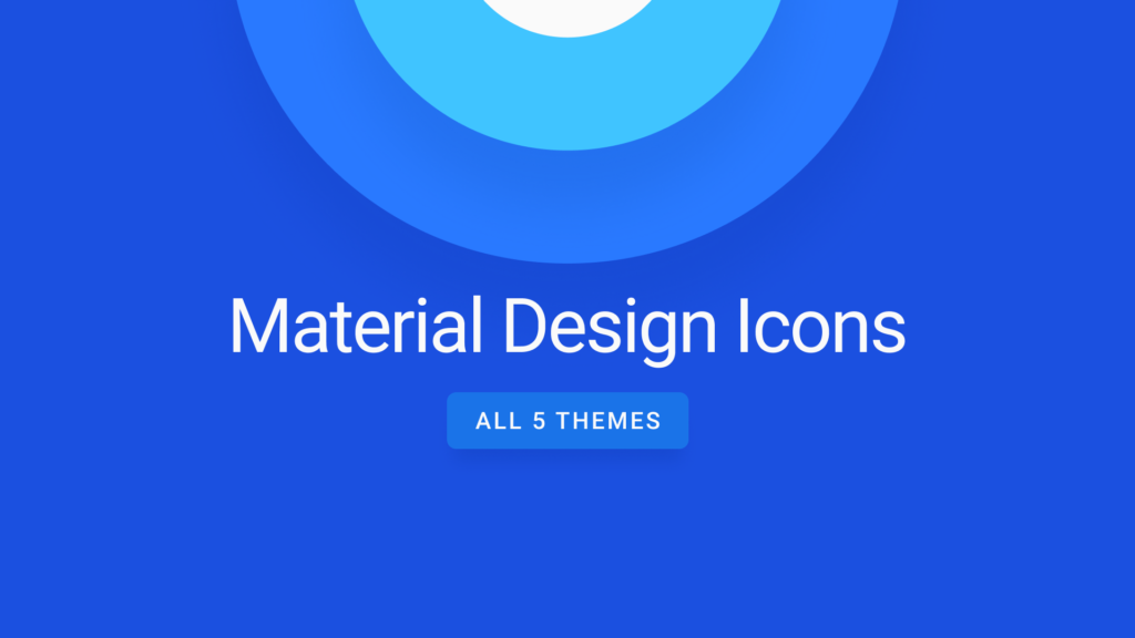
This amazing file contains all 5 Material Icon themes. All icons are organised in 24px frames and converted into components. This one has been a lifesaver for us to hit the ground running when starting all sorts of mobile and desktop design projects. Strangely enough, this file is not “official” (as in it wasn’t uploaded by the Material Design team), so kudos to its creator Jonny for the hard (and necessary) work!
Material Icons—Sharp

This is Figma’s attempt at creating a Material Icon library. The file obviously contains the icons as a complete set of Figma components ready for use. The main downside for us is that they’ve separated the icon themes in different files, which you could argue is a bit cumbersome if you’re going to combine some of them. You can find the rest of the icon themes here.
Android system components
If you want to take your mockups the extra mile you might also want to include some Android system components such as status bars, keyboards, navigation bars, etc. At this point in time we haven’t found any complete file in Figma Community that contains such assets (especially for the later Android 10 and 11 versions), so in our case we’ve ended up using a combination of different components found in separate Figma Community files such as Shrine, Android Navigations and Android Keyboard Kit. Do let us know in the comments if you’ve found a solution for this issue.
How we did it
The way we’ve approached it is by bringing the components found in these different Figma Community files together into the same file and making that our library for the project. The first step would be to select which Material Design UI kit and Material Design Icons set we’re going to use. Let’s say for this example that from all the kits listed above we’re going to use the Material Baseline Design Kit and the Material Design Icons kit.
Since the Material Baseline Design Kit file is the one that contains all the base text and colour styles, we’re going to duplicate that file from the Figma Community page into our project folder and rename it with our new library name (in this example we’ve called ours “Android Library”).
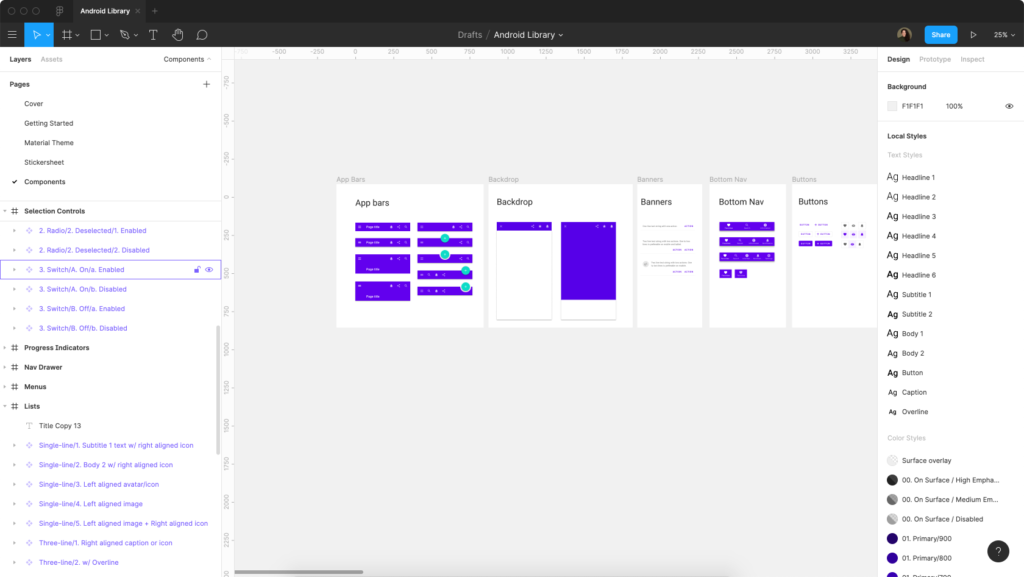
To keep our library as clean and usable as possible, the next step would be to get rid of any unnecessary pages. In our case we’ve chosen to remove all existing pages except for “Material Theme” (which contains the guidelines of the text and colour styles used in the file) and “Components” (the one that contains the actual Material Design components we want to use in our designs).
Next up we have to bring the Material Icons into our file. You could argue that this is an unnecessary step and you could use the Material Icons file from Figma Community as a separate library (and that’s perfectly fine too), but in our case we wanted to keep our library to a single file and ensure that all the icons were using the correct colour style from the start. Which brings us to the next step, replacing the colours used in the icons with the current file’s colour styles.
To do this quickly we can select all the frames in our Material Icons page and use the handy “Selection Colours” section to replace all the colours used in that selection with the right ones. If you’re still following us at this point, remember to detach all the icon component instances (they are going to be component instances since you pasted them from a different file) and create them as new components again (you can use a plugin like Similayer to speed this process up).
The last big step we have left now is to customise the default text and colour styles that came with the original file to the ones from our own project. Thanks to the way styles are set up in Figma, making a change to a style will instantly make a global change across your entire document, which means that all your components are immediately going to use your project’s text and colour styles.
If you want, you can also create an additional page for those Android system components we were talking about earlier and repeat the process we did for the icons to use the colour styles from our file. Last but not least, don’t forget to hit that “Publish” button and make your new file available as a project library.
In conclusion…
Ultimately, there’s no right or wrong way to choose and set up a UI kit as a base for your new design. Figma Community provides a pretty extensive library of pre-built assets, so we hope this little bit of research helps you speed up your workflow in Figma when kickstarting your next project for Android!
Subscribe to our newsletter
Receive blog highlights and fresh insights into UX/UI and front-end development.
Leave a comment
Your email address will not be published. Required fields are marked *