Good Design is a Snowball
I have developed a theory recently, that good design is self-enforcing. Like a snowball, good design begets more good design. What I mean is, in order for an organisation to grow from design-curious to design-driven, you need good design in the first place. Does that sound like a conundrum? It is.
Digital Belgium
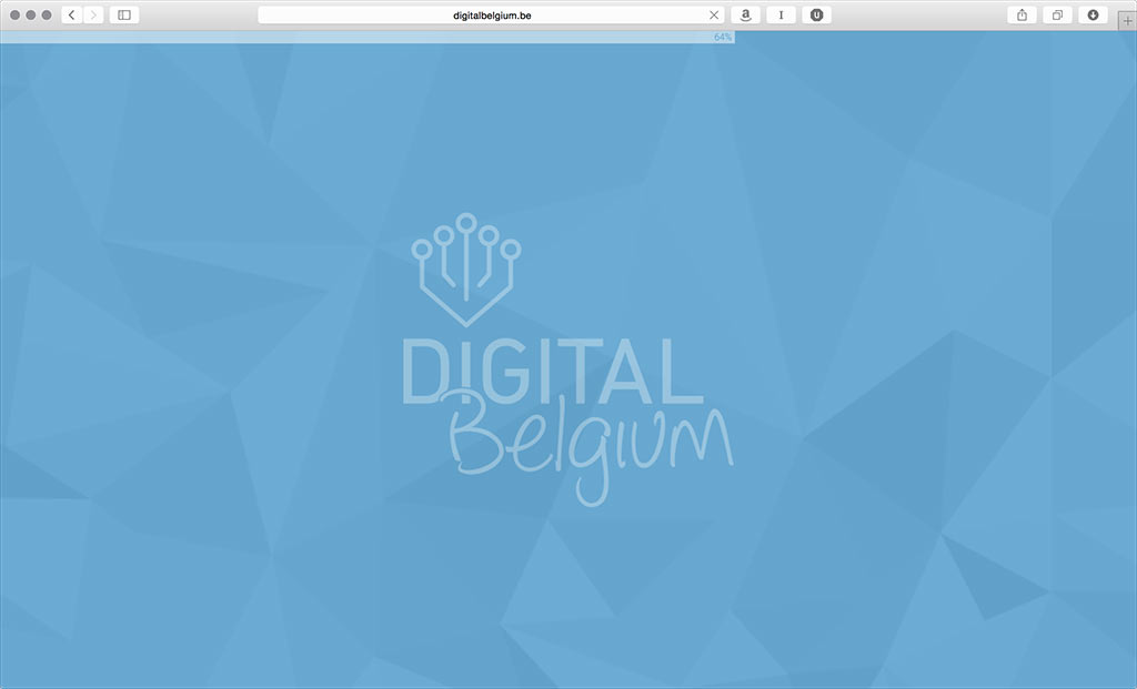
Alexander De Croo of the Belgian federal government recently released the Digital Belgium campaign. I was so happy they even had a plan, that I eagerly clicked the link everyone was tweeting about. Imagine my face when they kicked off the campaign with this monster:

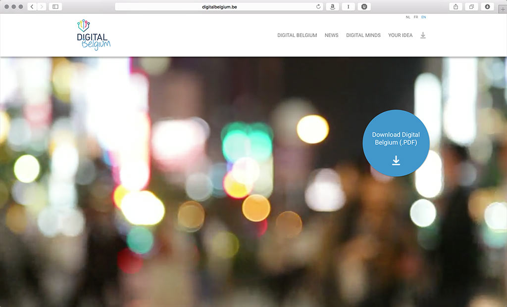
Yes, that is a loading progress bar for a website released in April 2015. That logo is also completely tasteless. But it gets better. I scroll, lo and behold:

Yes, that is a big Download Digital Belgium (.PDF) button on top of a video showing nothing useful at all. You just made me load a very big website in order to make me download an even bigger PDF file. And I still have no clue what this is about.
Belgium is the country of Magritte, but even that is no excuse. When you launch a campaign to promote the digital economy, this is a problem. If this is to serve as an example of what our digital future looks like, I think I will pass.
Something We Can Believe In
I believe Alexander De Croo is serious about pushing things forward on the digital front. If he wants to succeed, he has to make sure that people prefer a digital service over their non-digital counterpart. You need a good designer, one who understands people (and so much more), at the heart of your project in order to achieve that.
This campaign is sending the signal that good digital design does not matter. And by extension, that people do not matter. That if we send folders to people, but now as a “digital” PDF, everything will be okay. That approach is flawed and I sincerely hope someone will correct it.
You do not inspire people to drive electrical cars by building a bad one and telling them your plan. You build one they can believe in
Flanders: A Good Example
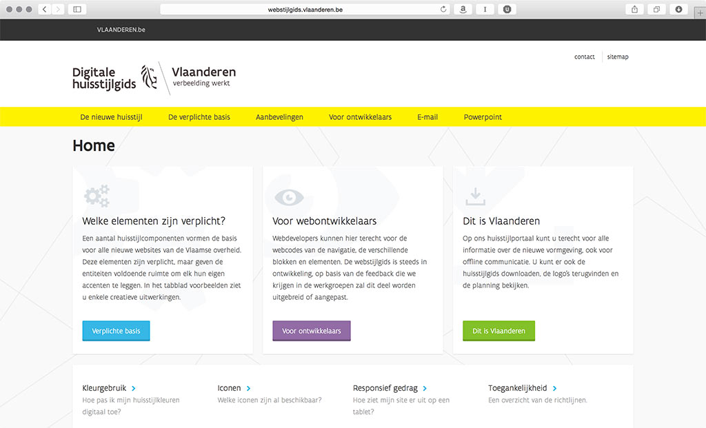
Recently, unknown people in the Flemish government decided that design is a serious thing. I do not know who, nor why, but I would like to thank them2. In a short period of time, they released new brand guidelines and a new, solid website. They restructured content. They even had their own typeface designed, by a Belgian, notably. That is a clear indication that design is on someone’s agenda. When design is on your agenda, people are on your agenda. And this is the result:

Working as a designer for the Flemish government has suddenly become fun. The guidelines make sense. They work on a high level and the government is leading by example. As a designer working on some government-issued projects, it is encouraging me to do one better than the original. That is a high bar. Even if I end up below that bar, the result is still good.

All It Takes Is Curiosity
If the Flemish government can achieve this with Belgian designers, then clearly talent is not the problem. We are at a rare moment in time where it seems Belgium boasts some of the most forward-thinking, world class digital designers. Let us put that talent to use to create a better, more people-friendly government. One that can lead by example, one that is world-class and can inspire other Belgian companies to do the same. All it takes is to be design-curious, and start rolling the snowball.
1. Yes, that is a Tesla and Obama reference all in under 140 characters. Back to top
2. If you are that person, or know the person responsible for this, please let me know via xb@mono.company, via twitter or in the comments. I would like to thank them for doing such a splendid job. Back to top
Subscribe to our newsletter
Receive blog highlights and fresh insights into UX/UI and front-end development.

Leave a comment
Your email address will not be published. Required fields are marked *