Eight lessons from creating a design system

Over the past six months we have worked on a large scale design system. When we were nearing a big release, I wrote down some key lessons.
1. A design system is ever-evolving
Don’t expect a magic deliverable. Just like there’s no such thing as “handing over the UX”, there’s no final deliverable when releasing a design system. A design system keeps on evolving.
2. A design system should be based on actual needs
The design system reacts to real user and product needs. You can’t just take an existing design system and apply it to your situation.
While there are parallels between most design systems, there are also vast differences between design systems. For example, every design system likely has a button component. Some design systems are focused on mobile usage. Others are a result of the need for a scalable enterprise-style UI that can show big amounts of data on large monitors. Being aware of actual needs helps you to make the right choices.
3. A design system doesn’t live in a vacuum
A design system is useless if there isn’t an agreement on the decisions made. Decisions cannot be made in a vacuum.
It is useful to keep a log of why a certain decision was made to avoid backtracking. This can be done in an issue tracker like Github Issues.
As an outside consulting party, this is one of our biggest challenges – to find the balance between our internal design discussions and the external needs (from users, product managers, front-end developers etc.).
4. A design system can start humbly
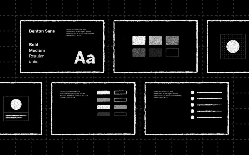
Think about a page that states which fonts and which colors to use. Think about agreeing on a set of icons.
A design template with components in a single design app can be the beginning of your system – but don’t see this as the end deliverable.
A lot more work goes into a design system than just having a clean design file with hundreds of components. The first file is just the beginning.

5. A design system should be based on underlying principles
The decisions made in the design system need to have an external reasoning. There are often technical reasons why things are the way they are — for example, buttons are a certain sizes because of touch devices. Other things might be the way they are because of project requirements, such as universal access. But besides that, there are choices that have to be made based on what kind of design a company wants.
In the book Design Systems, author Alla Kholmatova explains how to handle a workshop to define design principles.
One of the most important lessons here is that a design principle should ideally not be a negative when you reverse it. “Simple” becomes “Complex” when you reverse it – but nobody likes complex.
“Timeless” reversed becomes “Trendy”. Do you want to be “Fun” or ”Serious”? In both examples, neither of the two are bad; a definition of what you want to be is a great exercise within the context of a design system.
6. In a good design system, design is in sync with development
The “single source of truth” is the holy grail in the design vs. development discussion.
In our most extensive design system, there is a website that lists design patterns, but also colors, typography, icons and brand usage (this part is kind of like a traditional style guide).
We combined this with an implementation of static HTML and CSS components that became the base for the next level of implementation in React.
Keeping a part of the design system in static HTML/CSS makes it easier to use the design system together with multiple technologies in the future and does not lock everything down to one single technology.

7. Treat a design system like a product, not a project
A design system is not an afterthought that you quickly make when the project is done.
In order for a design system to work, it eventually needs to become its own project. There is a reason why companies with successful design systems such as Github, Shopify and IBM have dedicated teams to work on the design system.
8. A design system needs to be communicated
A design system has to be communicated. Depending on the scale of the project, there are different solutions, such as a public website, issue trackers, change-logs and a blog (or all of these).
It needs to be clear for every team where you should go to find your information. You shouldn’t have to hunt for some vague file on Google Drive to find the information you need.
In most cases, the best solution is a public website that is accessible to everyone. A static website is easy to deploy and is shareable via a single URL.
Subscribe to our newsletter
Receive blog highlights and fresh insights into UX/UI and front-end development.

Leave a comment
Your email address will not be published. Required fields are marked *