April: design systems, living styleguides & Electron
The month of April flew by, and we once again have a few updates for you.
I would like to talk about the themes within our work. These themes span multiple projects; and our learnings within these themes inform every project we do.
Design Systems
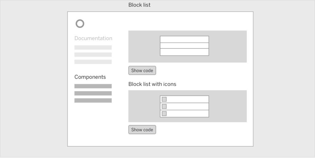
Within most of our projects, we document components in a style guide. We use our static site generator Bedrock for this.

Figure: Wireframe showing the basic structure of component documentation
Now, recently, there is a growing demand for full-on design systems.
Creating a design system is a more involved task. It also includes the principles behind the system, it documents things such as tone of voice or how to use components within design patterns (e.g. messaging).
It’s only logical to document your systems. This has been done for years, so in a way this is a new name for something old. But I do believe there is a difference now. If you do it right the documentation feels a lot more alive (as is explained in the next section).
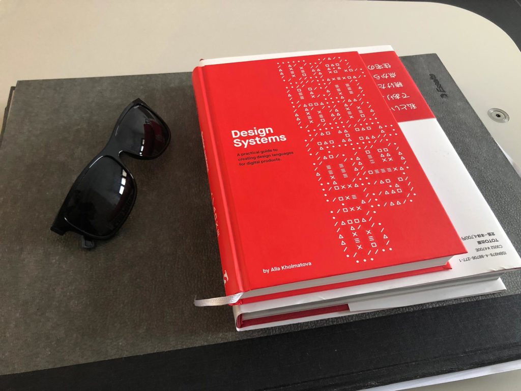
If you are interested in learning about this topic, I can recommend Alla Kholmatova’s book Design Systems.

Living styleguide
You could make your design system a static website, but as I like to say – static documentation is a lie waiting to happen; so why not make it dynamic?
In a living style guide, the documented components are using the same Javascript code as in the implementation (which these days is usually React, Vue or Angular) to be rendered. This provides a single source of truth and it’s the method successfully used by companies such as Shopify and AirBnB.
Even cooler, you can make your documentation dynamic. If you look at Shopify’s Polaris Design System, they even document responsive components (seemingly using container queries).
Polaris is obviously a very custom solution, backed by a large company. There are off-the-shelf solutions to document Javascript components, the most known one being
But the quality and (perhaps ironically) the “book” aspect (i.e. written documentation) is just not there.
It is our belief that the reasoning behind a component and the component needs to live together. StoryBook does not provide this yet so one of our design challenges is working on a custom solution that can stand next to the likes of something like Polaris.
Wrapped desktop apps (Electron)
The trend to wrap web applications in a desktop app is also going strong.
There are numerous advantages to this approach for certain apps but it has to be stated that one does not simply wrap a website in an app.
A recent example in the wild is Github Desktop which touts itself as “the new Native”. That it *ahem* a bit overstated, as a great native implementation will always be better.
The very Github app weights in at a hefty 164Mb because it ships a version of Chrome with it.

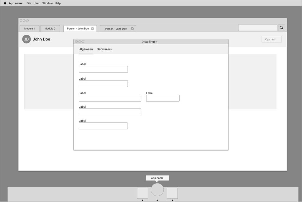
Figure: wireframe to illustrate the idea to consider using actual windows instead of web style modals in wrapped apps
However, given business constraints, a wrapped app often might be the wise choice for a lot of situations. You can efficiently reuse your HTML and CSS from existing web applications to save on front-end costs; and custom UI work is actually realistic instead of crazy expensive.
The thing is that on order to do a wrapped app properly, the app needs to be considered as a desktop application.
This has design consequences, the biggest ones being a change in navigation (if you are coming from a web app you are losing the browser’s navigation); and implementing ways to integrate with existing system logic (e.g. context menus and global menu’s).
Working on this topic is a personal favorite of mine, since I love desktop apps. For me the computer is a personal productivity tool, and the productivity tools I did my best (creative) work in have traditionally been desktop-based apps.
So, that’s it for this month!
Subscribe to our newsletter
Receive blog highlights and fresh insights into UX/UI and front-end development.