Five tips to write more accessible HTML
1. Start off right with a well-formed <head> section
Always specify the doctype in your HTML. This lets browsers know which version of HTML you are using and avoids your browser from going into quirks mode which may risk your page to appear broken.
<!doctype html>Also, specify the language of your document by using the language attribute.
<html lang="en">If you don’t, you might run the risk of the wrong voice profile being triggered by a screen reader, which could lead to weird and inaccessible pronunciations of your content. As a bonus, this also makes your content more indexable by search engines and makes it translatable by third-party tools.
2. Be careful about your assumptions about HTML’s built-in accessibility
It’s often stated that HTML is accessible by default. Yet, when you get to the bottom of it, actually testing complex HTML, you’ll often find that browsers ship with inaccessible HTML.
Recently, the GDS design team (responsible for the GOV.UK project), published a great blog post where they state that HTML elements such as a number input should maybe be avoided. In response, Dave Rupert made a list of the inaccessible parts of HTML. In general, don’t assume that because it’s standard HTML, that it’s inherently accessible.
3. Semantics matter
Not everyone accessing your site will see the full version of your website as you intended it.

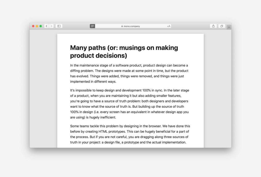
Safari’s reading mode only takes the structured content of your page and displays it with custom styles. An RSS reader reads your content in a different format – whatever you publish in your RSS feed. Search index bots (such as Google’s indexer) look at the raw HTML and try to derive meaning from that. CSS might not be loaded due to a network problem. Because it’s highly unpredictable how your page will be accessed (and what might go wrong in the process), it is important to always maintain good semantic markup.
What does this mean? It’s important to use the right HTML elements as much as possible. For example, if you use the native button HTML element, this will automatically make it focusable, and include it in the keyboard tab order.
If you use any other HTML element, you may have to add this in with CSS and JavaScript, making your button prone to breaking if these are not loaded properly.
4. Make use of landmarks
Screen reader users will often use landmarks to navigate through your application. Example screen reader software includes Apple’s VoiceOver, JAWS and NVDA.
Landmarks help users set expectations for the type of content they can find throughout your application. For example, a landmark with the role="main" will help users understand that this is where the main content of the page lives.
HTML elements such as <header> and <footer> automatically become landmarks. There is no need to mark them with the respective ARIA roles.
Check whether your website conforms to a logical structure.
5. Maintain a semantic header structure
Another way in which screen reader users navigate through your content is based on the header structure, therefore it is important to always follow the order of headings on the page.
Try not to skip any headings. If it should look smaller you can always use CSS to alter the styling, as long as you use the appropriate heading level semantically.
Sometimes you don’t want a header to be visible. In this case, it’s important to only hide it visually and still provide it for screen reader users. Here’s a snippet of CSS we like to use to hide something visually, while still making it available to screen reader users.
.u-sr-accessible {
  position: absolute;
  left: -10000px;
  top: auto;
  width: 1px;
  height: 1px;
  overflow: hidden;
}
That’s it for our five tips on writing more accessible HTML. The topic of web accessibility is top of mind for us, so stay tuned for more posts around this.
Subscribe to our newsletter
Receive blog highlights and fresh insights into UX/UI and front-end development.

Leave a comment
Your email address will not be published. Required fields are marked *